rd krč
A study of the conversion of a family house from the 1990s into a two-generation family villa.
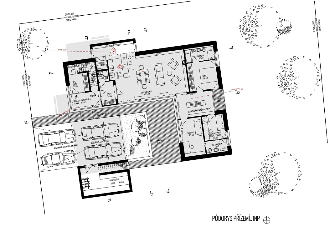
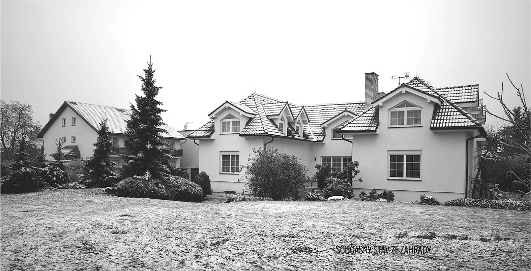
The redeveloped design is characterized by an intersection preserving the advantages of the existing house and replacing conflicting or defective features with new ones. The layout of the house outlines the space of two separate apartments, which together utilize a garden, entrance, cellar and storage space.
BACKGROUND URBANISM
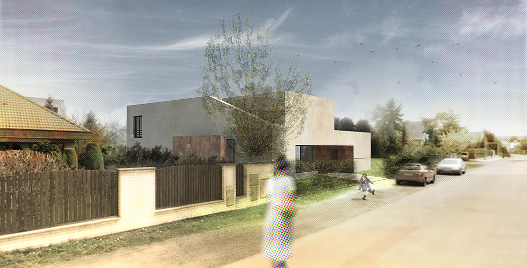
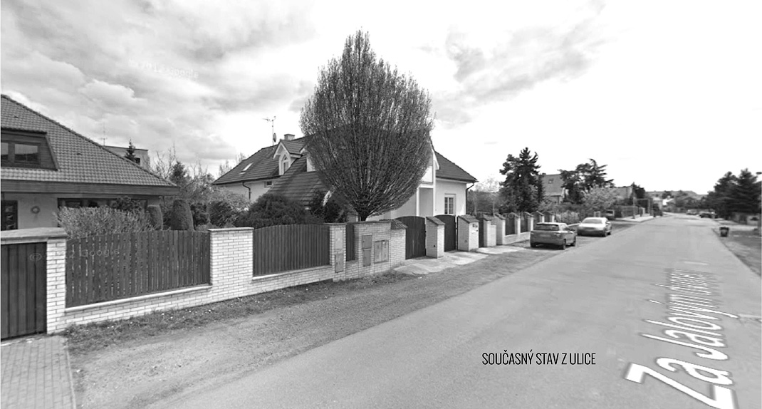
The cubic shape and scale of the reconstruction is in accordance with the architectural nature of the surrounding development.
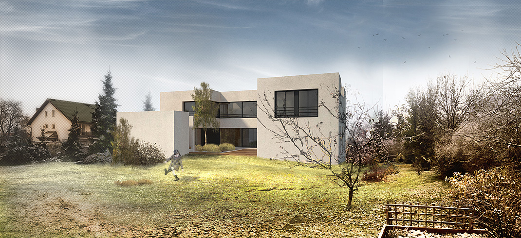
The basic shape and scale of the proposed reconstruction accentuates the (not very clear) street line and the relationship with the architecture of the surrounding houses. The expression of the cubic mass of the house is calm, almost puristic. The simplicity of the facades balance the sculptural diversity in the approach to shaping the villa’s mass. It is built upon the existing outline of the house.
BACKGROUND OF SHARED AREAS
Shared places are the essence of common living, not only the context of apartments.
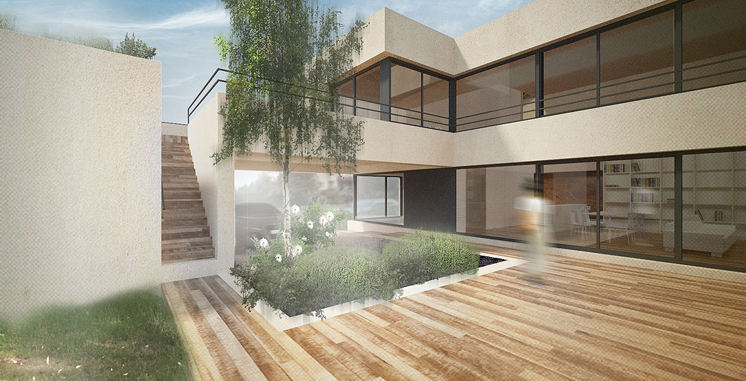
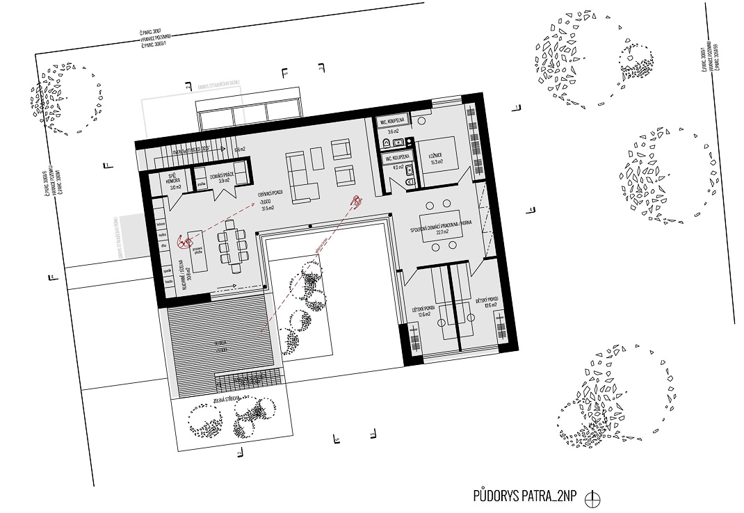
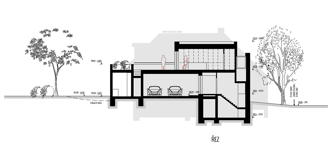
The possibility of sharing the entrance and garden terrace is the essence of the conversion into a functioning two-generation villa. Both spaces are located in the core of the building, they are oriented to the common and daily used parts of both apartments, and open further into the garden and into the entrance from the street. The ground floor apartment can be accessed directly through the French windows, and the apartment on the first floor connects an outdoor staircase to the terrace. The main rooms share a basic layout of the flats; the living room on the ground floor is the social core of the building, upstairs is a room divided into three spaces – a living room, a dining room with kitchen and exit to the terrace. A shared study / playroom of parents and children, which creates the anteroom of private bedrooms. The entrance hall on the ground floor is common to both apartments and leads from the staircase to the common basement.
BACKGROUND TO PRIVACY
The attractiveness of common areas is conditioned by sweet seclusion.
The openness and the number of shared places counterbalance the concentration of bedrooms in private zones with their own facilities and predominant orientation in the quiet, green surroundings, in the eastern part of the garden. The bedroom has a bright dressing room with a loggia on the ground floor and a games room with a studio window upstairs. Commonly unused corridors at the point of transition from dormitories to bedrooms are replaced by intermediaries with a specific atmosphere and use.
EAST OF FEELING
A concept of a villa without dead spots.
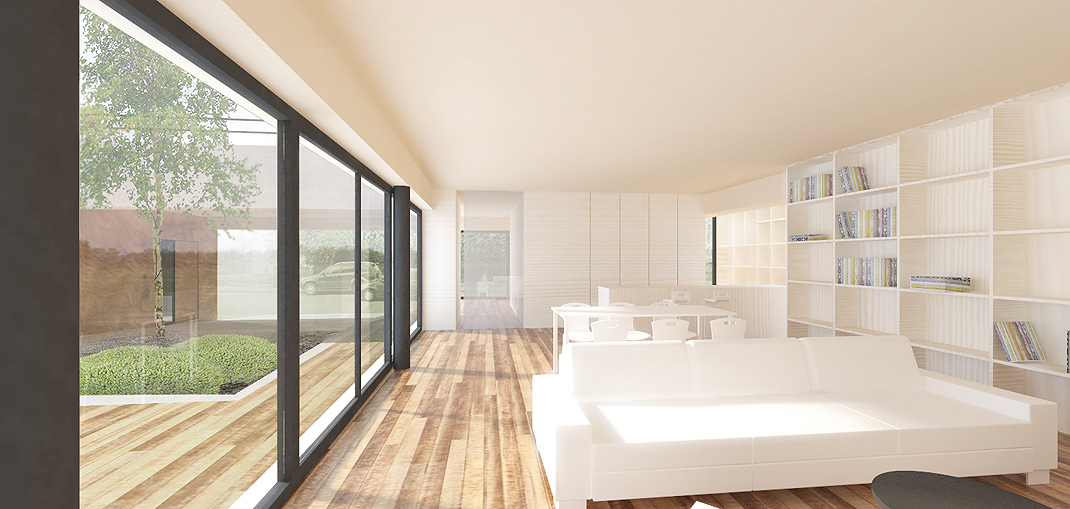
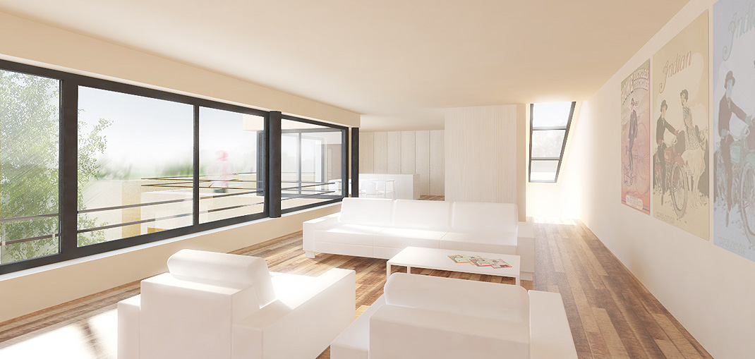
Both apartments, albeit in the core oriented to the common garden, have an unmistakable atmosphere of interior space, created by the insertion of experience places into a rational and purposeful disposition. The architecture begins where engineering ends (W. Gropius). The living room on the ground floor is oriented to the common garden terrace through the large windows all over the south side and is enriched from the north by the extended kitchen area extended in front of the north facade. From here you can see the “forgotten” northern part of the garden. The staircase to the upper apartment right from the entrance welcomes the incoming, opens into the room and through the long upper window attracts views of the crown of the hornbeam or the stars. Although the apartment is situated on the first floor, a glass window and roof terrace with staircase to the garden do not give space to doubt the garden as the most important part of the family house. The home playroom with study and studio window can be a place for parents and children to play together and do homework. The orientation and size of the windows more open to common areas and protect the privacy of the bedrooms.
ENERGY OPTIMIZATION
The initial size of the incumbent house is not the most economical in terms of the thermal-technical concept of the building – a large layout with large cooling areas. The reconstruction is therefore designed with the emphasis on the possibility of optimizing the energy standard of the building – the compact mass encloses a protected southern courtyard in the middle, opening it through large windows, while the windows are reduced from the north and around the perimeter.
INTERIOR
The color and material design of the interior develops the basic features of the layout – a clear, purposeful and quiet space. The light, and light color of the walls and furniture, combined with south-facing strip windows are a prerequisite for creating a richly lit interior environment. The basis of the welcoming space is to build on light natural surfaces of floors, which seamlessly passes into outdoor terraces and loggias.
A 2014 – 2016 study![]()
